
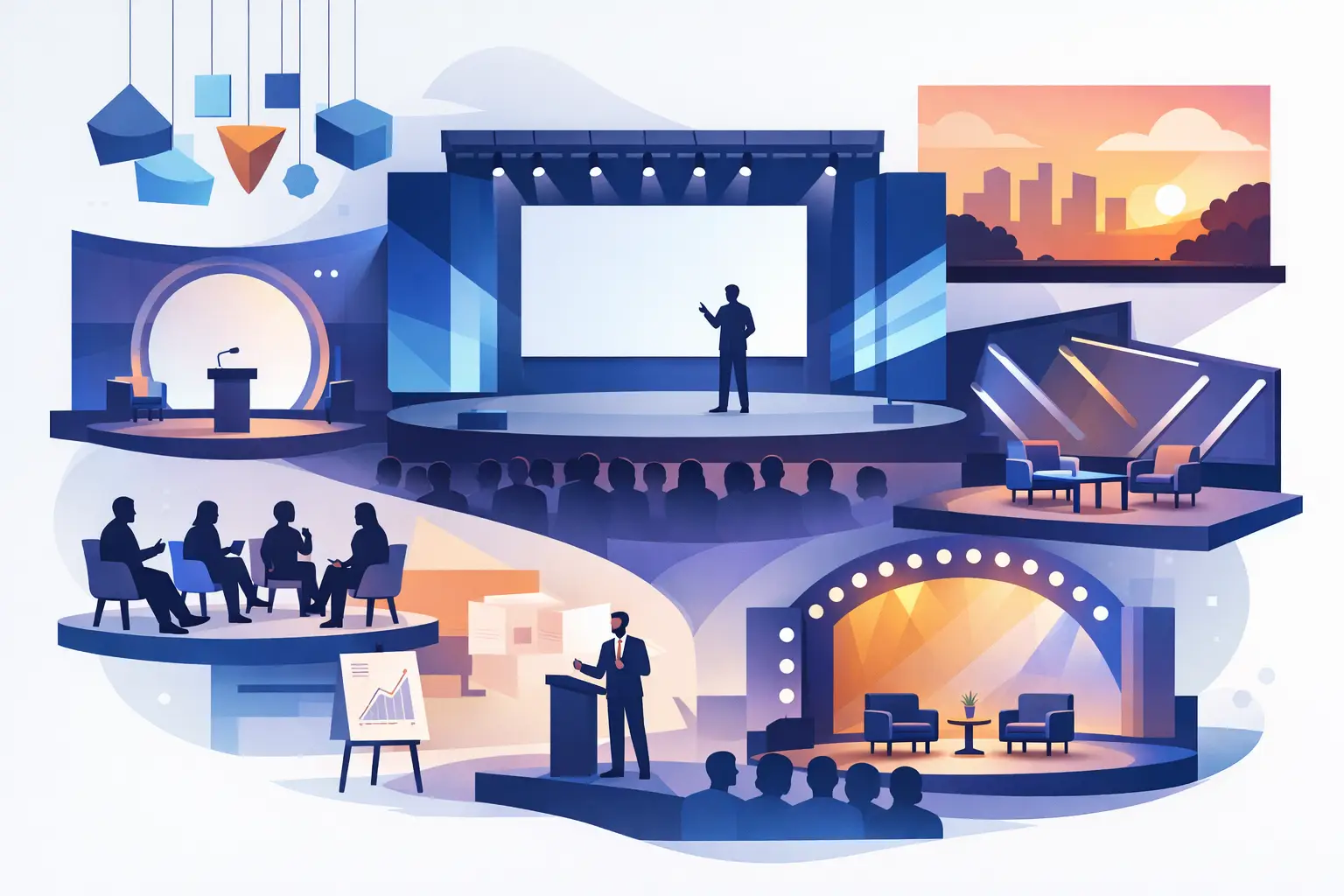
12 Conference Stage Design Ideas That Work
A conference stage has only a few seconds to establish confidence. Before the keynote begins, attendees have already formed an impression from the scale of the room, the clarity of the screen content, and whether the stage feels intentional. The best conference stage design ideas do more than look impressive in photos. They make speakers easier to follow, reinforce the brand, and support a program that runs without distraction.
For corporate events, the right approach is rarely the biggest LED wall or the most elaborate set. It is the design that fits the message, venue, audience size, camera plan, and production schedule. A leadership summit needs a different visual language than a product launch, awards dinner, or industry forum. These ideas help event teams make those decisions with purpose.
1. Build the stage around one clear message
Every visual choice should support the central purpose of the conference. If the event is focused on innovation, the stage can use clean geometry, dynamic motion graphics, and forward-looking lighting. If the program is about trust, strategy, or financial performance, a more refined structure with controlled color and restrained animation may be more appropriate.
Start with a short creative statement before selecting materials or screens. It could be as direct as: “A premium leadership platform built around clarity and momentum.” That statement becomes a filter for every decision, from the lectern finish to the opening video.
A stage with too many competing ideas can dilute the brand. One strong concept, carried consistently across scenic elements, printed assets, presentation templates, and digital content, creates a more credible experience.
2. Use LED walls with a content-first plan
LED walls have become a central feature of modern conference production because they deliver brightness, flexibility, and powerful branding. But a large display cannot compensate for weak content planning. A screen filled with dense slides, tiny charts, or low-resolution logos creates problems at scale.
Design presentation content for the viewing distance in the room. Key messages should be readable from the back row, and motion graphics should support the speaker instead of demanding attention. Consider how the screen will appear on camera as well. A design that looks balanced to the live audience may need adjustment for livestream viewers.
Wide LED canvases work well for immersive opening moments and panoramic branding. A central screen with supporting side displays can be a better fit for content-heavy conferences where close-up camera shots and detailed presentations matter most.
3. Create depth with layered scenic elements
A flat backdrop can feel temporary, even when the graphics are well designed. Layered stage elements add dimension and give the camera more visual interest. This can include branded frames, architectural panels, illuminated fins, fabric textures, or raised platforms positioned around the LED display.
The goal is not decoration for its own sake. Layers can conceal technical infrastructure, define the speaker area, and create useful separation between the stage and the surrounding venue. They also help the stage retain presence when screens are dark between sessions.
Physical scenic pieces are especially valuable for executive conferences, award ceremonies, and premium client events where the environment must feel considered from every angle.
4. Design for sightlines before aesthetics
A visually striking stage fails if attendees cannot see the speaker or the content. Sightline planning should happen early, particularly in hotel ballrooms, exhibition halls, and venues with low ceilings or structural columns.
Review seating layouts alongside the stage concept. A wide stage may require additional displays for guests seated at the far edges. A tall scenic piece can block views from a balcony. Even a lectern placed slightly off-center can affect how well cameras capture both the presenter and the screen.
This is where operational discipline matters. The production team should assess room dimensions, ceiling height, screen placement, lighting positions, access routes, and camera locations before finalizing the creative. Strong stage design is always built on practical planning.
5. Use lighting to direct attention
Lighting sets the pace of a conference. It can make a keynote feel focused and authoritative, transition the room into an awards segment, or introduce energy before a product reveal. More fixtures do not automatically mean better results. The priority is controlled lighting that serves the agenda.
A clean front wash keeps speakers visible and camera-ready. Backlighting can add separation and depth, while color accents extend the visual identity beyond the screen. Programmed lighting cues should follow the run of show so changes feel deliberate rather than random.
For longer conference days, avoid using highly saturated colors or fast-moving effects continuously. These can tire the audience and make the room feel less professional. Reserve stronger lighting moments for entrances, transitions, walk-on music, and major announcements.
6. Make the speaker area feel natural
Speakers perform better when the stage supports their style. A CEO delivering a formal address may prefer a lectern and confidence monitor. A panel discussion needs comfortable seating, practical side tables, clean microphone placement, and enough space for natural conversation. A product expert demonstrating a solution may need a display surface, confidence monitor, and clear access to technical equipment.
Avoid treating furniture as an afterthought. Its scale, finish, and placement should align with the scenic design and the event brand. A furniture layout that looks elegant but forces panelists to turn away from the audience will reduce engagement.
Rehearsals are essential. They allow presenters to test walk-on routes, screen visibility, teleprompter placement, microphone coverage, and presentation controls before the room is full.
7. Extend the brand beyond the main screen
The strongest conference stage design ideas treat the stage as part of a complete environment, not an isolated set. Brand consistency should continue through registration, wayfinding, stage wings, lecterns, holding slides, name badges, printed materials, and social media capture areas.
This does not mean placing a logo on every surface. It means using the same visual system throughout the attendee journey: typography, color, graphic devices, tone of voice, and image style. When the environment feels connected, the event appears more organized and the brand is easier to remember.
For organizations managing multiple vendors, this is often where quality begins to fragment. An integrated creative and production partner can protect visual consistency from concept development through on-site installation.
8. Plan for cameras, not just the room
Many corporate conferences now serve two audiences at once: attendees in the room and viewers joining remotely or watching later. Stage design needs to work for both.
Camera framing affects the placement of logos, furniture, screens, and scenic features. A logo that is visible to the audience may be hidden behind the speaker on camera. A bright LED wall may require careful camera settings to prevent visual flicker or exposure issues. Panel setups also need enough depth so shots do not appear flat.
Plan a camera-safe background for key speaker positions. Keep essential branding within the likely frame, and use lower-third graphics or screen content to identify speakers rather than crowding the physical stage with signage.
9. Introduce movement with purpose
Movement can make a stage feel current and responsive. Animated graphics, kinetic lighting, moving scenic components, and timed entrance sequences can add energy when they are tied to the program.
For example, a short motion sequence can introduce each conference theme, while changing screen layouts can distinguish keynotes from panel discussions. These moments help attendees understand that the agenda is progressing.
The trade-off is complexity. Every moving element adds rehearsal time, technical dependencies, and potential points of failure. For an executive forum with a tight schedule, simple and precisely executed transitions often create more confidence than ambitious effects that interrupt the flow.
10. Design sustainable elements for reuse
Not every stage component needs to be built from scratch. Modular frames, reusable LED configurations, fabric systems, and adaptable scenic panels can reduce waste and improve budget efficiency across recurring events.
A reusable structure should still feel tailored. Replaceable branded skins, digital content packages, lighting treatments, and carefully selected furniture can transform the same core system for different audiences and themes. This is particularly useful for companies running roadshows, annual meetings, or multi-city leadership programs.
Sustainability works best when it is planned from the first creative discussion. Retrofitting it at the final production stage can limit material choices and compromise the design.
11. Give transitions the same attention as keynotes
Audiences remember how an event feels between sessions. Blank screens, unplanned pauses, and visible technical resets can weaken an otherwise strong program. Design holding slides, walk-in music, lighting looks, and short transition content as part of the stage experience.
A well-managed transition gives the production team time to reset microphones, furniture, and presentation inputs without exposing the work happening behind the scenes. It also maintains momentum for attendees.
This is a practical area where detailed show calling and technical coordination protect the creative investment. A polished stage is only fully effective when the experience on it is equally polished.
12. Match ambition to the budget and timeline
A memorable stage is not defined by cost alone. Smaller conferences can make a strong impression with disciplined branding, excellent screen content, clean lighting, and a smart room layout. Larger budgets may justify custom scenic builds, advanced automation, multiple screens, and broadcast-quality camera production.
Be clear about the priorities early. If the primary goal is thought leadership, invest in speaker visibility, content support, and sound quality. If the event is a major brand launch, prioritize reveal moments, immersive visuals, and media-ready backdrops. Trying to maximize every feature can spread the budget too thin.
The most successful conference stages feel effortless because the creative concept and the production plan were developed together. Whether the brief calls for a streamlined executive forum or a high-impact corporate launch, T2 Arabia approaches the stage as a working brand platform, planned for audience attention, technical reliability, and lasting visual value.
A useful final test is simple: stand in the last row, look at the stage through a camera frame, and ask whether the message is still clear. If it is, the design is doing its job.